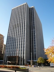
Place Bell Canada
I recently had a chance to visit a building I used to manage as part of a portfolio a while ago. I’ve moved away from the area but a client meeting brought me back to the city.
It’s a 1 Million sq.ft. building opened in 1972 as a corporate office for Bell Canada. Combined with its multi-story above ground parking lot, it sits on a full city block with 33,000 sq.ft. floor plates.
What struck me most were the subtle yet powerful details that were done in the public areas.While the exterior cladding was the same and most of the interior lobby, corridor walls and flooring was the same beautiful travertine, they had redone key areas to make it more modern, inviting and visually interesting. Instead of a radical change, they took the entrances to the two main corridors and added some treatment to make it feel like you were entering a new place.
The ceiling and light sconces were new and with moderate lighting, gave the feeling of a casual street scape. They removed segments of the wall along the long corridors and inset burnished black frame display cases to break up the monotony of otherwise long walls.
The doors to the FM office and a few other service areas off the main corridor as well as the fronts of the retail stores in the back end of the building were changed to the same burnished black finish with nice, consistent signage for each one of them above their entrances in the same color as the store fronts.
In the original lobby there was a huge dark tapestry hanging on the far wall as you entered. I remember the challenges of cleaning it, requiring a search for a company with the knowledge and skills, not to mention approval from the original artist. Its gone now and the lobby feels more open now. They also did a few things that we talked about when I was managing it, but never implemented. The security desk was moved from a nook in one of the corridors (which was also the control room) to the front lobby where they could greet visitors. An octagonal retail space in the back of the building around which traffic had to walk as they got to the end of the two main corridors was removed and the space opened up. It was hard to fill with retail anyway. They also added new seating in the front lobby made out of the same travertine material as the rest of the surfaces.
Outside, there were a few other subtle but important changes. They improved the entrance to make it more inviting and replaced the ugly stone pebble encased planters (that surrounded the exits from the basement level) with more modern looking ones. All along the overhang, which spans around the entire block, they added some nice metal details that added a modern image without significantly changing the building.
I don’t know what they’ve done to the systems, but my last effort before leaving was to get approval for a complete upgrade of the elevators, including the cabs, from the corporate owner just before it was sold as a sale/leaseback deal. The new owner immediately implemented the project. That success getting capital was the result of a great business case that had details of all failures and complaints over the previous year as well as performance data from the elevator company’s tests. The facts and evidence were indisputable and i got funding when my colleague in a similarly sized building who also submitted an elevator modernization program didn’t get funding. It came down to information and evidence. Two powerful partners in a business case.
After over 10 years, It was nice to walk through a revitalized building. The changes would have been quite an investment, but much less than a complete overhaul. It respected the beauty and history of the original structure while updated it’s appearance significantly.
[important title=”On a humorous note”] I remember finding documentation from when the building was opened. According to the rules, you weren’t able to eat at your desk, you had to eat in the cafeteria. And live plants were banned. Both seemed to be related to unwanted pests. But the funny thing is, you were allowed to smoke at your desk. Times have changed.[/important]


Michel
Great stuff, thanks for the advice for my elevator mod business case. Cheers.
Rob
Rob, good luck with your business case. It’s always a good idea to have as much data and information as possible to support a business case. The decision makers not only see the merits of your case better based on data, they are usually more confident in approving if they know that there is substance behind the business case and that you’ve done your homework and know your stuff. This is especially important if they aren’t experts themselves and are relying on your advice.