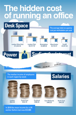
This graphic does a great job of simplifying the total cost of corporate office space (plus a few other costs) in a way that a written explanation simply can’t – with visualization.
If you’ve never heard of an Infographic, this is one of them.
It’s a very tall image so we’ve split it and provided just the top and bottom parts here to give you an idea. There are a few other statistics about office costs that very interesting on the missing middle part. Either double click the image to the left or click the More button below to see the full-sized graphic.
It’s difficult to print out, but do it anyway and use it to demonstrate the high value of what you do as a Facility Manager for your organization.
It used UK based costing and statistics, but you can use the concept to illustrate the costs within your own organization to help promote what you do and what it really costs. Use some of the numbers a starting point and do your own math to get what you need for your situation. You may want to leave out some of the statistics on the middle part of the graphic, since these relate more to HR issues than CRE / Facilities. There are other costs you may want to include, however. Even if it isn’t your specific costs, it is useful to illustrate the total cost of occupancy.
While this infographic about a Facility Management topic is very useful, the true value, I think, is to demonstrate the use of an Infographic to convey information. Hopefullly you will use the concept the next time you have information to share. You can continue to use reports, presentations and other traditional tools, but also use graphics to illustrate the core points in a way that attracts attention an helps the message stick with the audience or reader.
You don’t have to be a wizard at graphics, and they don’t have to be as elaborate as the ones in the samples below, but you get the idea. They can be accomplished with free tools and a little inspiration, which you can get from these links to other infographics. Browse through them and see how creatively information can be presented for better impact. You can use s Excel to create graphs, but don’t use the stock styles – Change the settings to make them more minimalist and punchier if you want to make an impression.
Sample Infographics
A selection of infographics to give you ideas about how to represent information.
Infographics Showcase
Cool Infographics
Daily Infographic
Free Images and Icons
Of course you need the tools to do the job, and here are free ones you can use, or you can have someone else more creatively inclined to create them for you. You can also use them for regular presentations or documents. Be sure to read the licencing information about how and where you can use them.
Stock.xchng (images)
Morgue File (images)
Smashing Magazine (icons)
Iconspedia (icons)
Free Photo Editors
While you could use Word , Powerpoint or their Mac equivalents for basic infographics, if you want to do them justice or make more complex ones, you really need a graphics editor. Here are some free ones.
Pixlr (A web based on-line editor)
Gimp Photo (a PC based photo editor)
Paint.net (another PC based photo editor)


