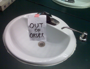
 Since I’m revising my presentation on communications for facility managers so I can deliver it at the ISSA conference in November, I was able to add this example of what not to do that I found recently in a washroom at a major facility.
While at least the handwriting is very neat and they got the spelling right, using a magic marker to make a sign isn’t the way to do it.
Its actually very easy to produce simple, professional signs on good card stock and actually include a message that instills a little professionalism. You don’t need a signage contractor, all you need is a computer and printer.
Unfortunately, not everyone on this facility’s FM team thinks it’s necessary. The head of facilities may not even realize that this is the type of signage the team is using, or is simply immune to it.
So the question is, do you have a handle on the signage your team puts up in your building to communicate facility issues and are you critical about its appearance and the message it conveys? And what about your projects? I’ve experience having a separate project management group doing work in buildings I manage and having to contend with terrible signage from them as well. In my 1 day workshop on strategic communications for facility managers, I include these and many other examples plus some exercises too.
And in this case, the logo example I use in my new book in the section about promoting yourself and your facilities department would have worked really well here. (also see the blog about FM marketing ideas).
While this is a very simply sign with a straight forward message, there are lots of good techniques to making signs readable and convey the message. You have to be especially careful with things you put in your lobby and elevator cabs – occupants will spend only so much time trying to read them to figure out what you want them to know. At the best of times, they will give you very limited attention, so you have to communicate quickly and efficiently anyway.
Both a professional image and good communication are important any time you put something up in your building, send a memo or create a newsletter. Sometimes having to deal with the day-to-day issues and focusing on space issues, moves, maintenance and work order calls from tenants and occupants can distract you from the other easy things, like communications and image, yet they are important too and can set the tone with your occupants.
So the next time a sign or notice goes up in your facility, make it a good one.


